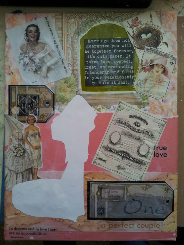
This week as I head into the studio, I am working on two wedding canvases. Wedding dresses require pale pastel colors, like blush, or white/creams. Essentially, your using your shadow colors to create depth. Lavender, pale blue, Payne's grey (cool grey with blue under tone) and ecru (a warm grey under tone).
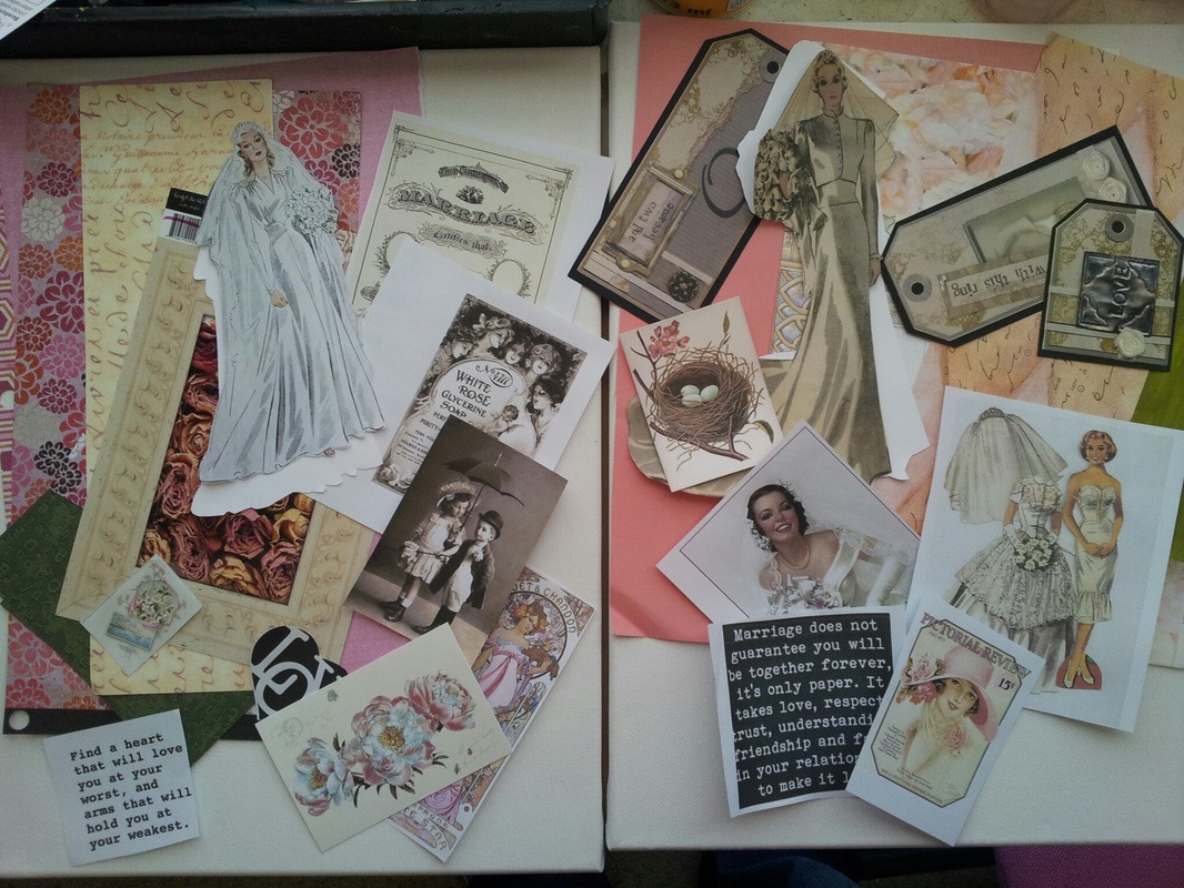
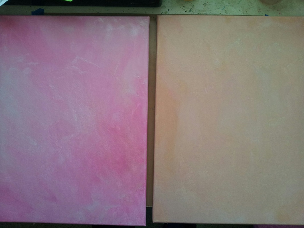
I began by pulling two sets of papers. Pinks for the bride in white and peach for the bride in ecru satin. I started by painting my canvases with a background color.
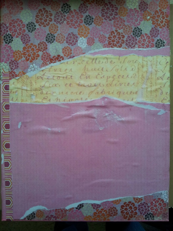
Next I added layers of patterned scrapbook paper to add texture and movement to the background. I choose a more modern, bolder graphic print for the pink layout.
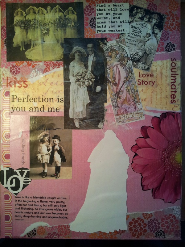
I began to add the vintage ephemera and text to the backgrounds.
Ran out of time this weekend but will post part two next week with close up photos of both brides.
 RSS Feed

