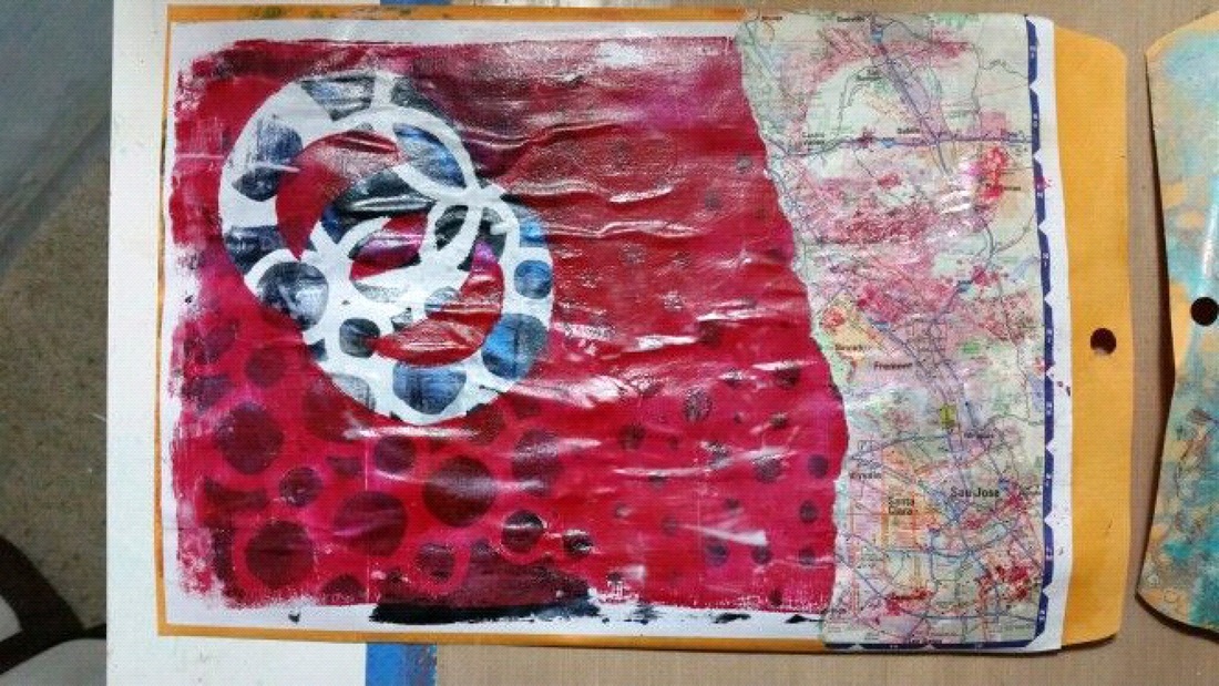
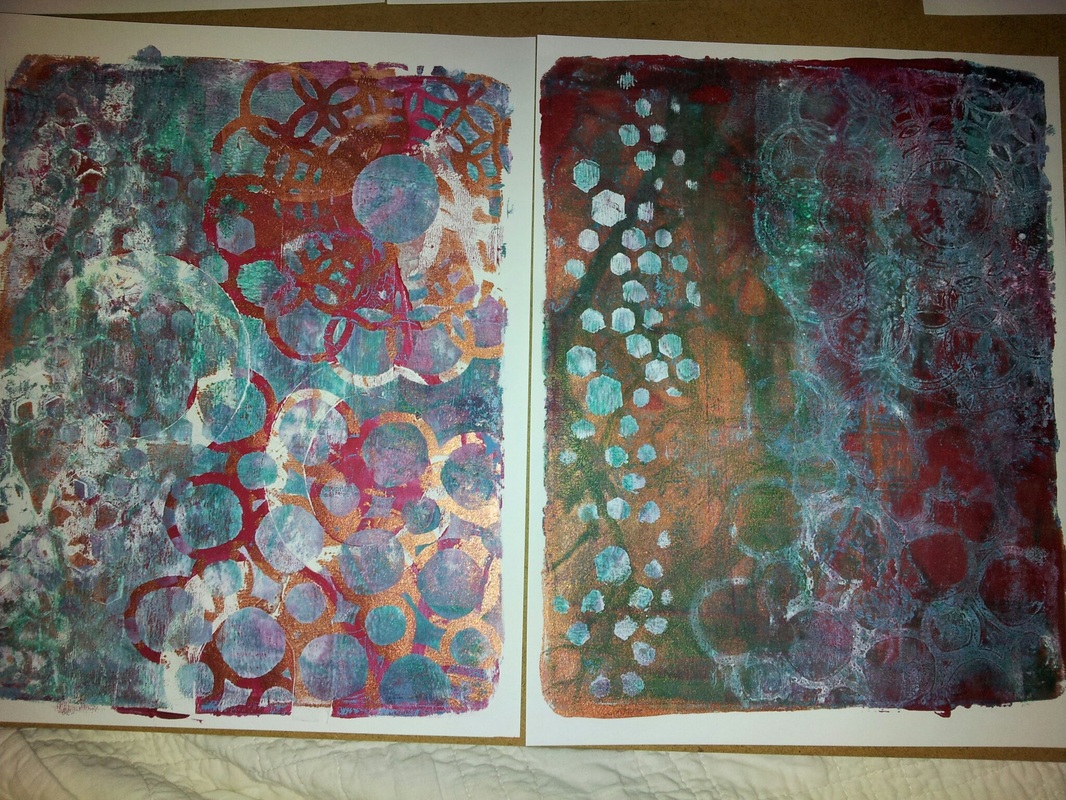
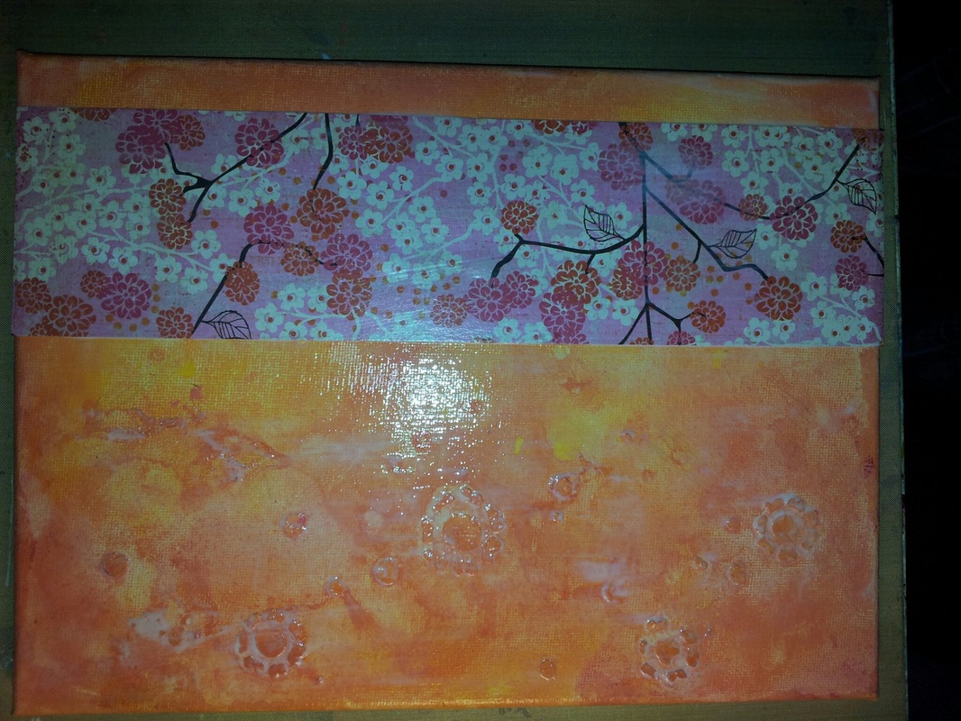
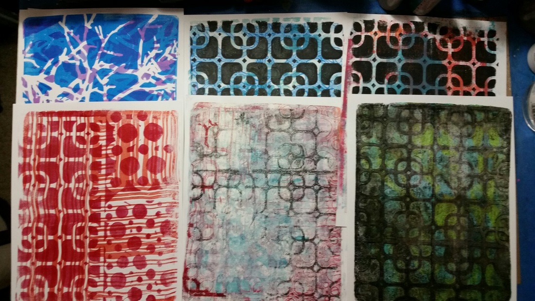
This week I set out to try two techniques seen on Gelli Arts® youtube channel. First, I worked on layering up colors and patterns to try the packing tape technique. I was pleased with my pattern and decided to try clear contact paper. Don't! The results were that all my work was lost. The contact paper did not adhere very well and the shiny surface was distracting. I was not able to use it.
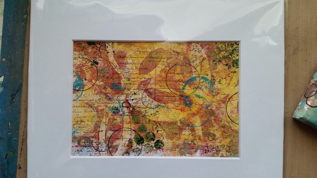
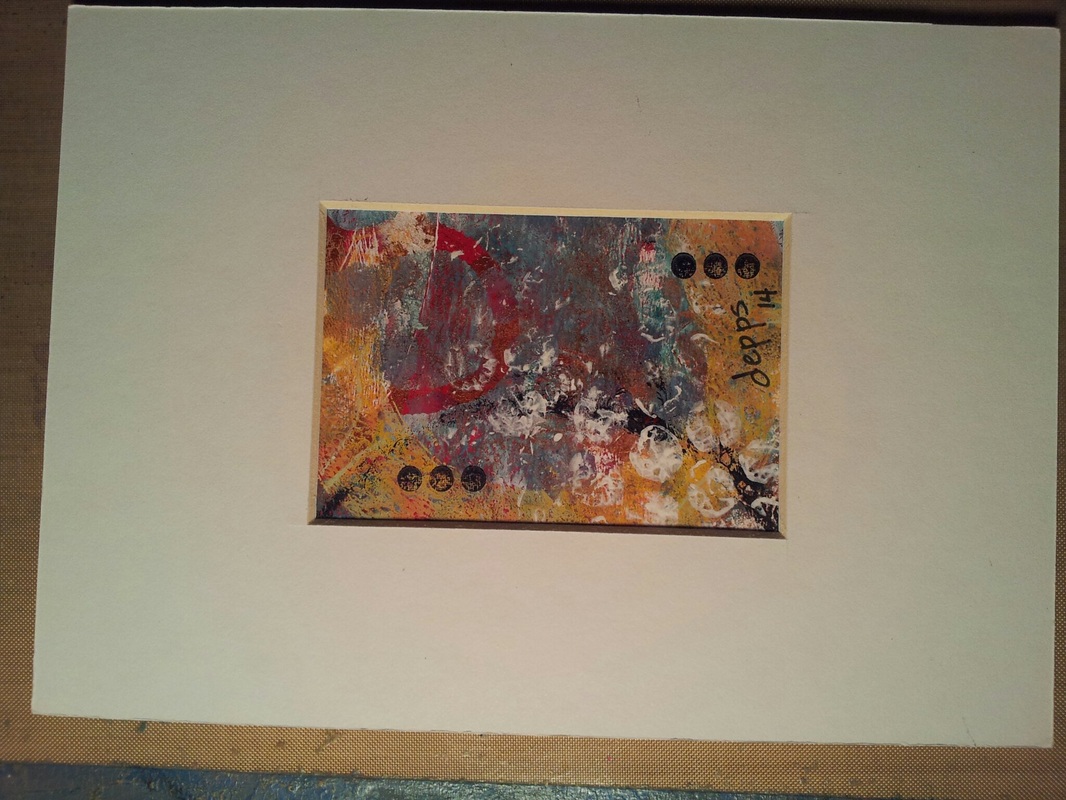
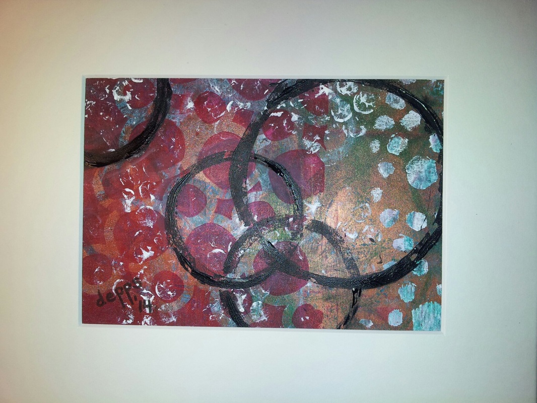
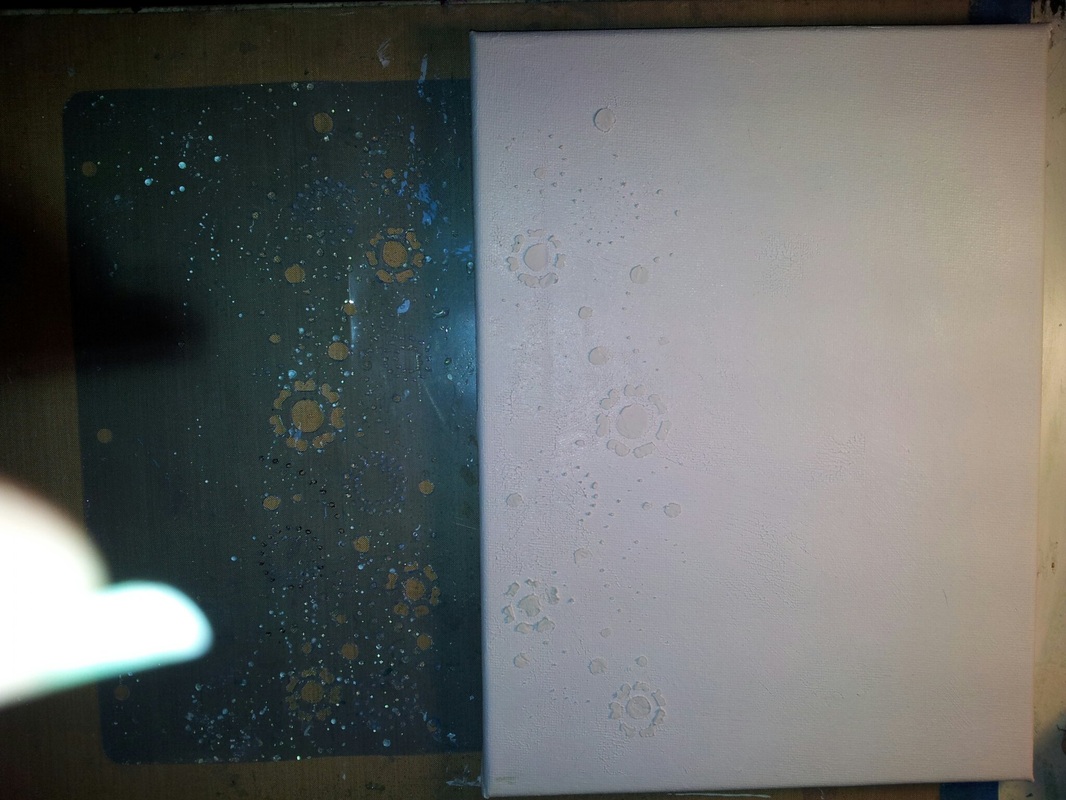
I also purchased Golden open acrylics to use on my plate. I was very pleased with the results. Do and do some more. I loved the translucent layers just using same color but changing stencil/mask. I found that I prefer to work light colors to dark colors. However, using black last did get very vibrant prints.
I also purchased Golden open acrylics to use on my plate. I was very pleased with the results. Do and do some more. I loved the translucent layers just using same color but changing stencil/mask. I found that I prefer to work light colors to dark colors. However, using black last did get very vibrant prints.
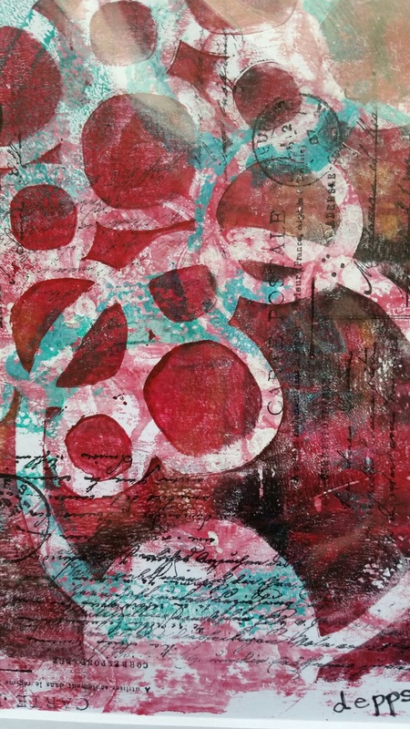
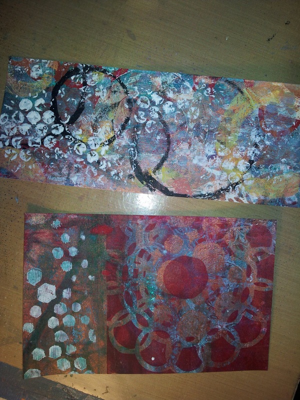
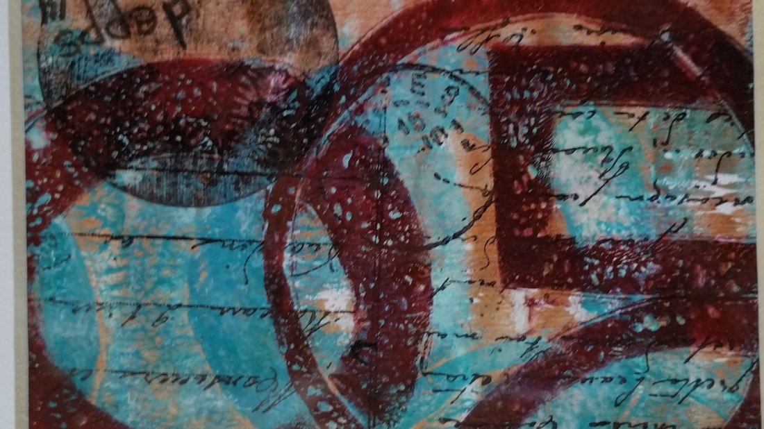
I made several prints but the ghost print was my favorite. I used circle mask cut from a plastic dividers.
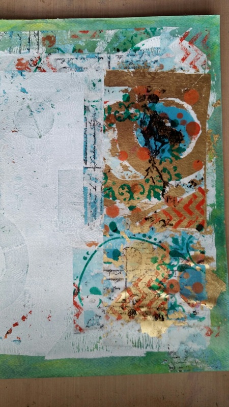
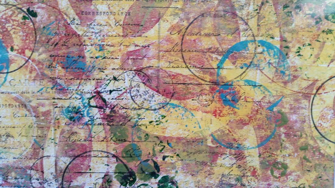
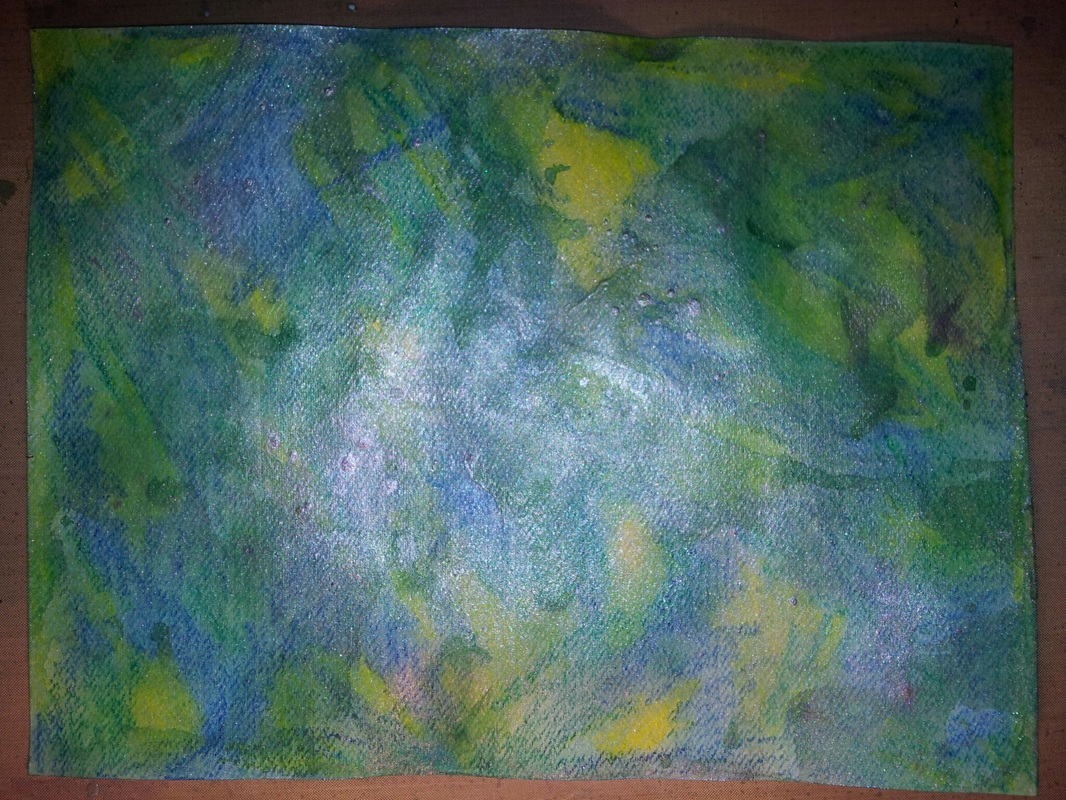
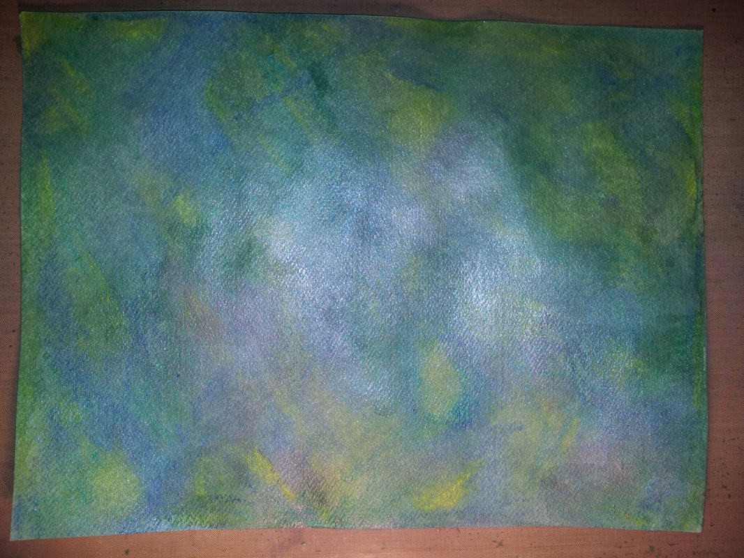
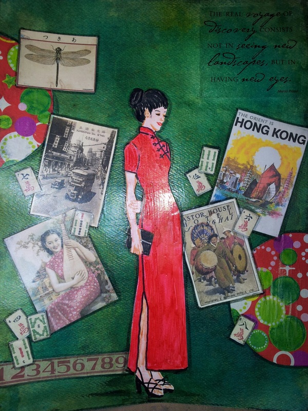
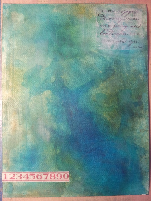
Here are the prints made with regular paints and open acrylics.
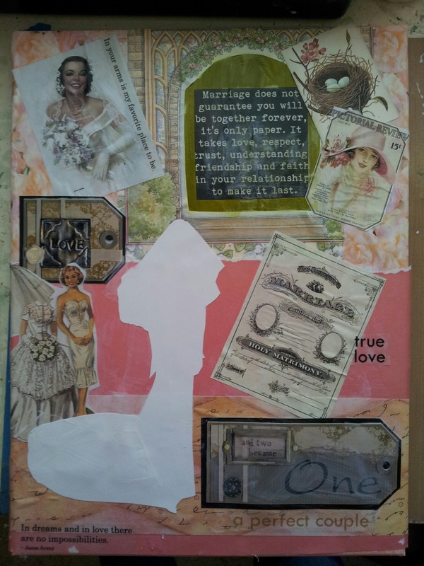
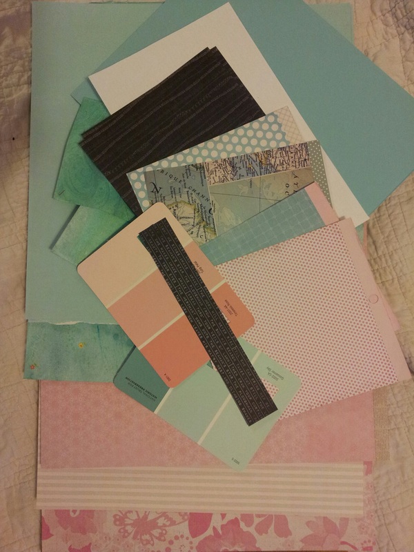
Do keep playing and don't give up. I usually work back and forth between 3 to 5 papers at one time. Remeber you may only use little sections of a larger print. Using a mat frame to see helped. *permission to use the Gelli® or Gelli Arts® trademark, which is owned by Gelli Arts® LLC
 RSS Feed

